UI / UX Designer
After the acquisition of two companies, Lantronix struggled with organizing its portfolio of products into an easy-to-navigate product hierarchy that was clear to site visitors - both old and new.
Many users told me that they were getting frustrated because they were spending too long trying to find a product and couldn't remember how to get to a certain product page.
Users in this context are anyone that interacts with our website, including our distributors, value-added resellers, investors, customers, even our internal sales and marketing team.
I can recall multiple meetings where a coworker would share their screen to show something on a product page, but would get lost in the process. And others in the meeting would have to help out by saying exactly where to hover or click.

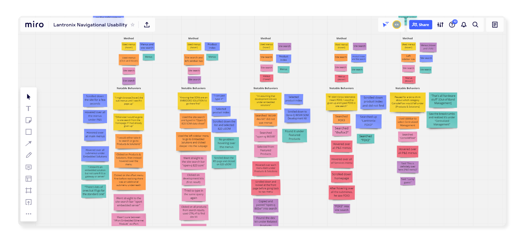
My first objective was trying to understand exactly how users navigated through our website to find a product. There are a number of ways to find our products: using the search bar, the navigation menu, product category pages, a product index, and "filter all products" page.
I wanted to see which method was the most common and exactly what steps users take for their preferred method.

I chose to conduct unmoderated usability testing because it would allow me to observe users every step and hear their thought process (via think-aloud protocol).
Not only was it important for me to observe the usability of the interface components on the website, but also dig deeper into potential information architecture problems due to new products being added onto the website. Therefore, I included tasks involving products belonging to different high-level categories (e.g. Embedded Solutions, External Gateways, Software Services)
Example Task
You are interested in Lantronix's tracking device, the FOX3. How would you find it on
our website?
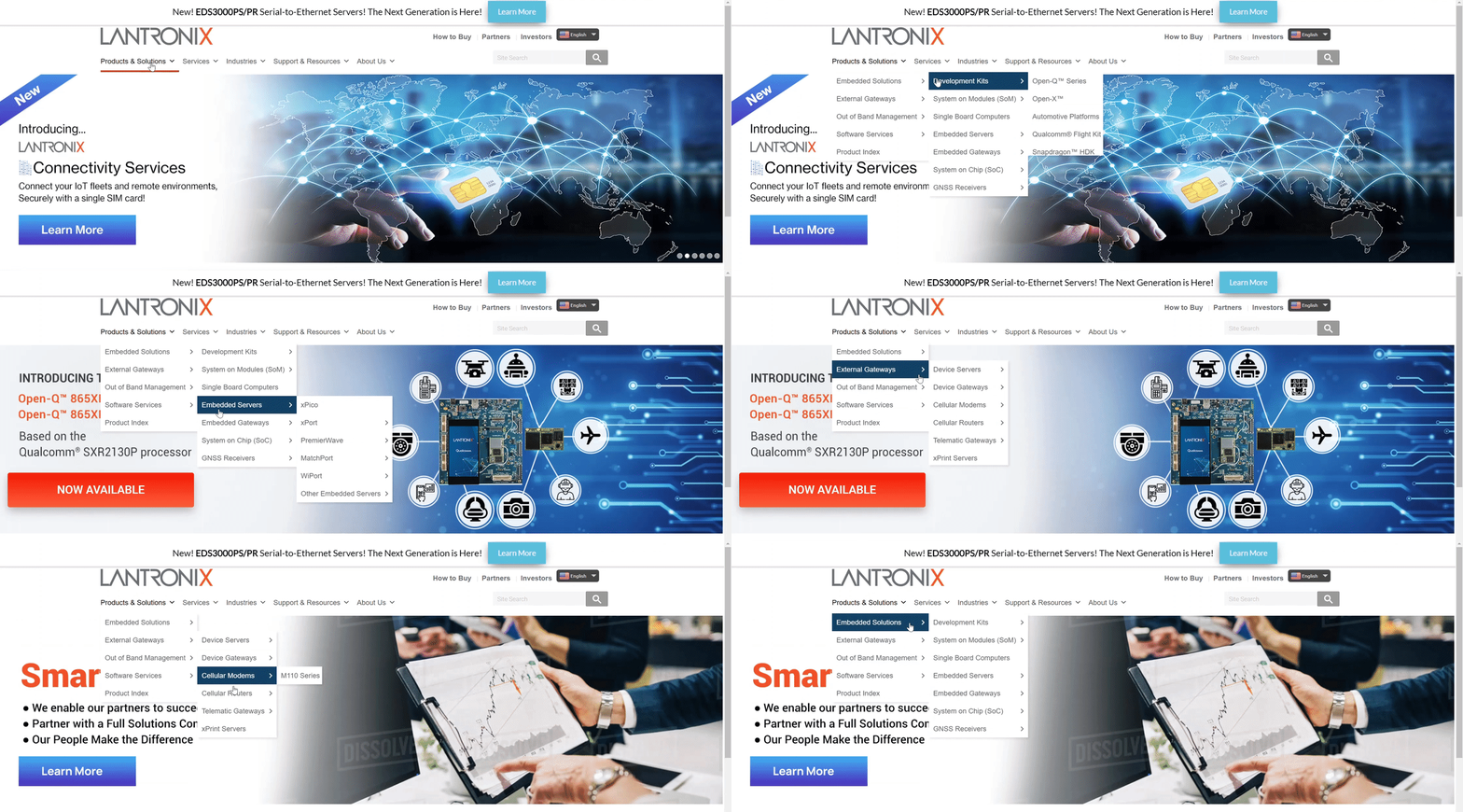
3 out of 7 participants accidentally clicked on a menu item when they meant to hover over it, causing them multiple tries to complete a task.
Because each product category has many subcategories, users repeatedly navigated down the tree in hopes that the product or category they're looking for shows up.
For example, the xPort is a device server, but some participants couldn't recall if it was a server or gateway. Therefore, a lot of time was spent exploring the menu items.
For example, all of the products from our acquired company, Intrinsyc, were lumped together into "Intelligent Edge Solutions," which doesn't provide enough context to users.
I worked collaboratively with product line management and marketing to come up with product category names that were a) intuitive to customers and b) cohesive among product lines.
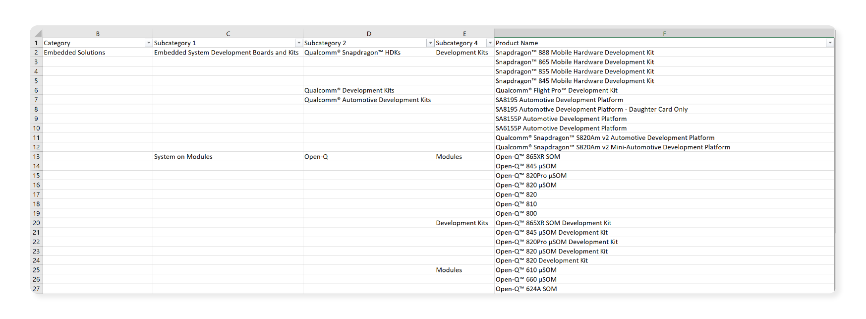
This would hope to solve the "guessing" game a lot of participants were playing in the usability test and reduce the amount of interaction required to view subcategories and products.

I used the Lantronix brand guideline to incorporate appropriate colors and fonts into the navigation menu.
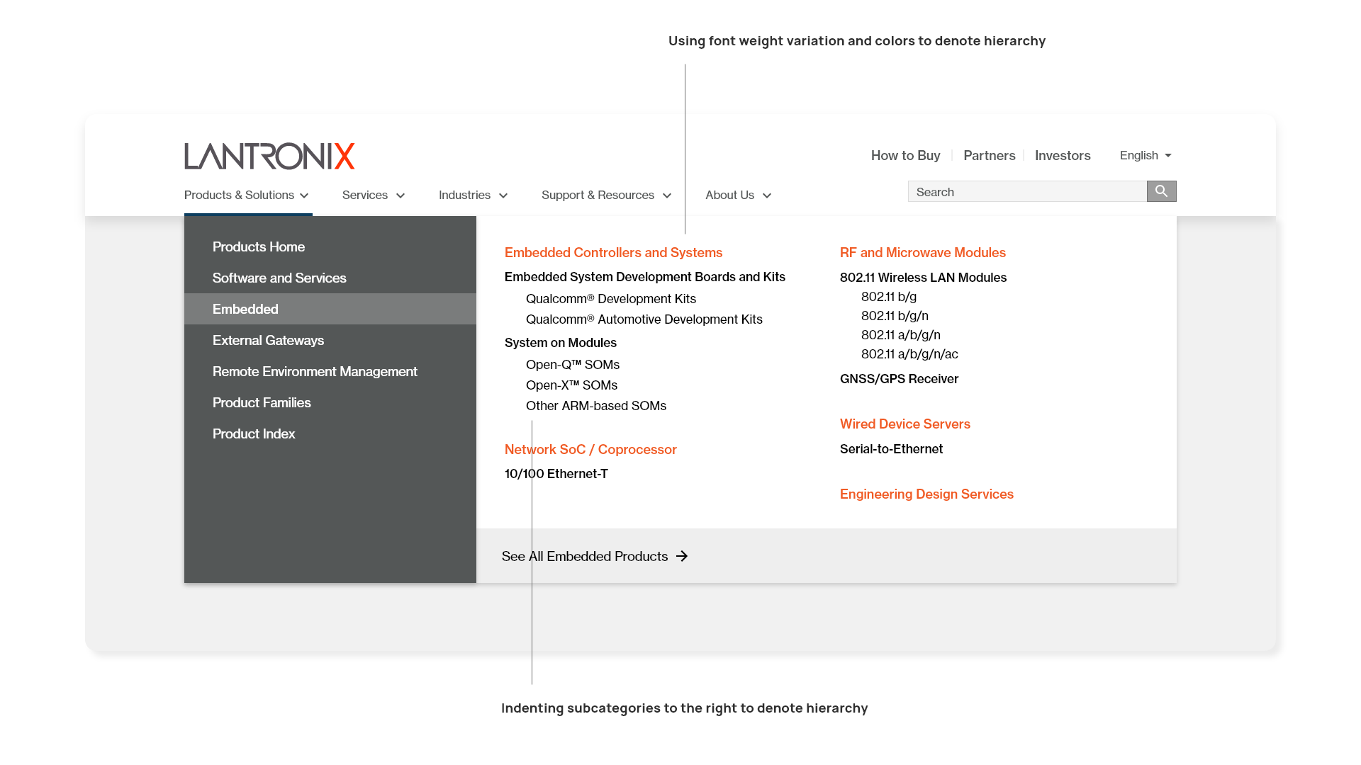
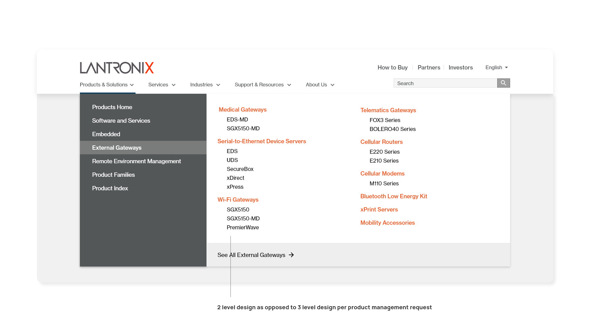
The WordPress plugin did not allow us to follow the design exactly as intended.
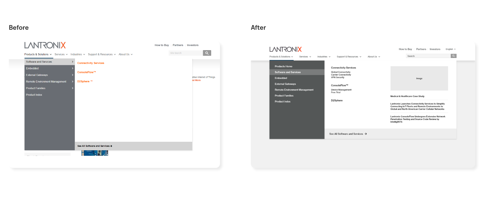
The content window would not change dynamically, and would retain the height of the category with the tallest height. As a result, a large amount of whitespace is shown on menus with few products.
To reduce time to production, I designed an alternative option to fill the whitespace with marketing content to help promote content related to our products, e.g. blog posts, case studies, and featured images.
Visual design is only one portion of improving the information architecture on the navigation menu.
After the web development team completes re-categorization of products, another layer of testing must be done to see if the visual design and product categorization has improved the user experience.